Coachella Rebranding
The Coachella rebranding project sought to address a pressing societal issue: the growing sense of disconnection and longing for genuine experiences in an increasingly digital age. As technology permeates every aspect of our lives, the authenticity of human connection and cultural engagement decreases. This shift led to a profound need for events that transcended mere entertainment, providing platforms for meaningful connections, artistic expression, and community building.
The Coachella rebranding project aimed to reimagine the festival experience, catering to the underlying needs and desires of my target audience such as cultivating their social skills, more opportunities for connection, and navigating around the festival with ease. It envisioned a space where attendees could immerse themselves in a vibrant community of like-minded individuals, with music and art acting as catalysts for genuine connections. This endeavor went beyond superficial changes; it aimed to fundamentally shift how people experienced Coachella.
Project for GPHD 145 (Typography II) and GPHD 135 (User Interface Design)
Year
Spring 2024
#Concepting
#Illustration
#Storytelling
#Userexperience
Branding Concept
The Coachella Valley Music and Arts Festival has become very well known throughout the years. It stands as a beacon of cultural resonance, its name synonymous with a kaleidoscope of emotions and experiences that resonate deeply with attendees worldwide. Since its inception in the late 1990s, Coachella has evolved from a modest gathering of music enthusiasts into a global phenomenon, a veritable pilgrimage for those seeking liberation through sound, art, and communal celebration.
Although the festival itself is constantly evolving, the branding has remained almost the same since the early 2000s; such as the iconic imagery of palm trees swaying against a desert backdrop, vibrant hues, and evocative typography. Coachella has long been revered for its eclectic mix of music genres, captivating art installations, and breathtaking desert backdrop.
It’s a celebration that transcends boundaries, inviting individuals from all walks of life to immerse themselves in a collective experience like no other. My rebranding endeavor aimed to encapsulate this essence — the spirit of boundless creativity, diversity, and connection. The collage of images I curated served as a window into the soul of Coachella. Words like “connection,” “immersive,” and “be you” echoed the festival’s ethos of inclusivity, self-expression, and communal unity, serving as guiding beacons in the rebranding process.
Central to my rebranding effort was the redesign of the festival’s logo. Drawing inspiration from Coachella’s energetic tone and spirit of boldness, I opted for a handwritten font that exudes dynamism and authenticity. The subtle elevation of the letters ‘o’ and ‘e’ within the logo symbolizes the beaten energy that courses through the festival grounds, evoking a sense of anticipation and excitement. One of the most distinctive features of my rebranded logo is the intentional connection between certain letters. This design choice serves as a visual metaphor for the connection that lies at the heart of Coachella. Just as festival-goers come together to celebrate music, art, and community, the intertwined letters symbolize the bonds.


Touchpoint 1: Awareness
The awareness touchpoint is where the audience finds out about Coachella. From a user perspective, individuals seek out information about events and experiences that align with their interests and desires. For many, the goal is to discover new opportunities for leisure, entertainment, and connection. From a business standpoint, the awareness touchpoint represents the initial opportunity to capture the attention of potential attendees and compel them to engage with the Coachella brand.
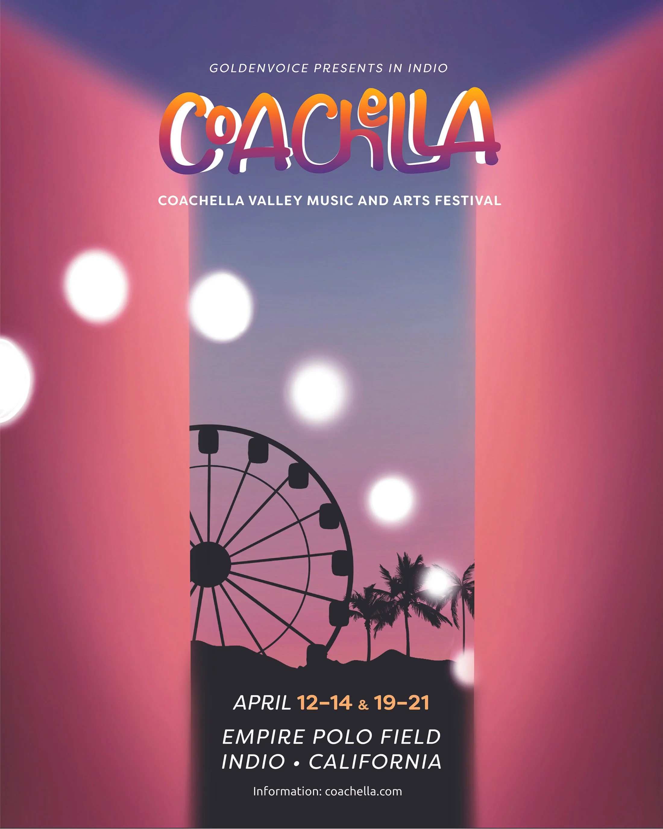
This billboard ads were positioned strategically along highways and thoroughfares. With their towering presence and eye-catching designs, these billboards commanded attention and sparked curiosity in the minds of passersby. The purpose of billboard ads was to create a physical presence for Coachella in the urban landscape, ensuring that the festival remains top of mind for individuals as they navigate their daily routines.
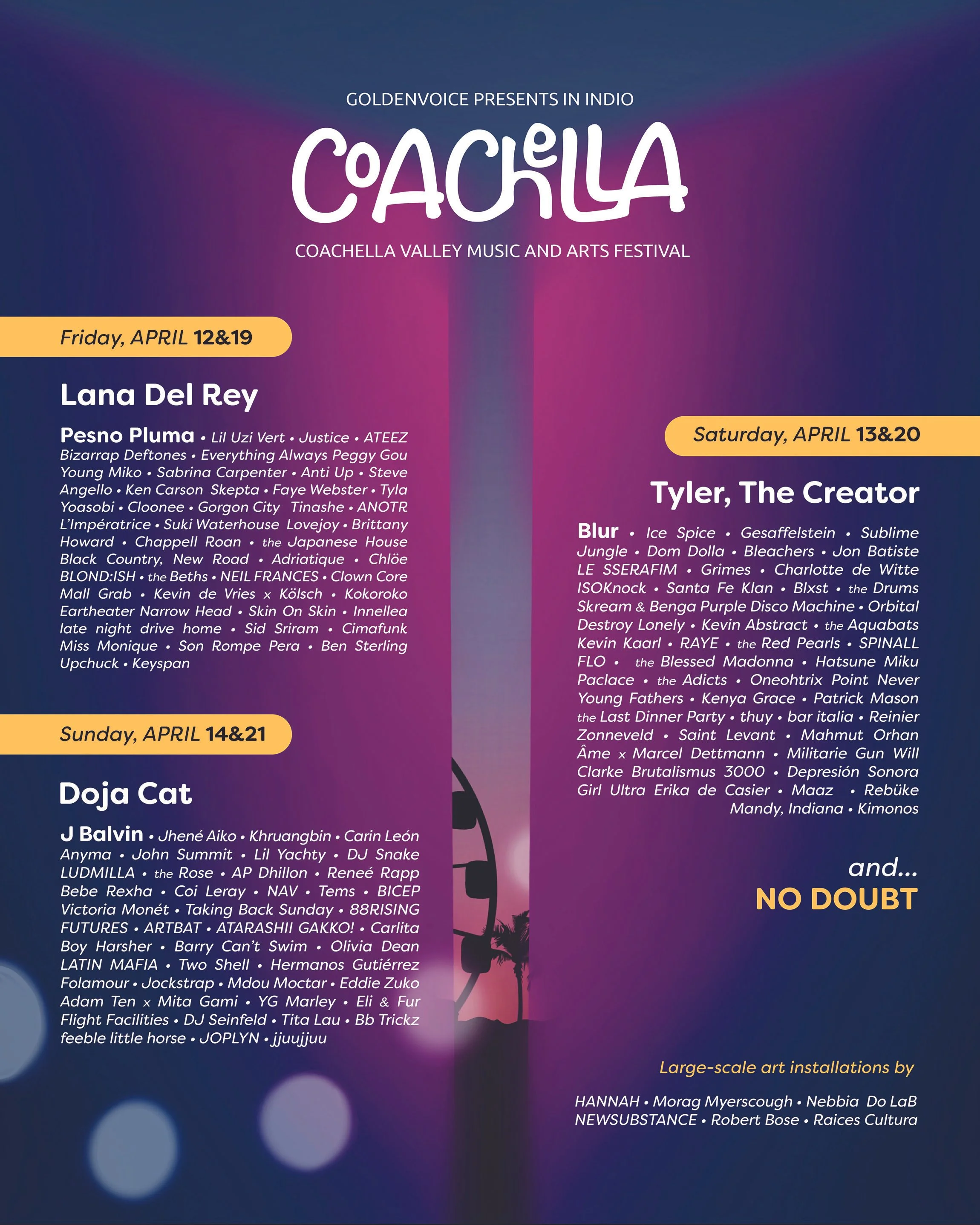
These posters featured a bold, eye-catching logo, drawing viewers in with a door opening to a whole scene of the Coachella desert. They were created with vivid colors reminiscent of a desert sunset that saturated the background to create a sense of warmth that is synonymous with the Coachella experience. Iconic imagery such as palm trees, a Ferris wheel, and a scene of sunset, evoke a sense of adventure to the viewer.
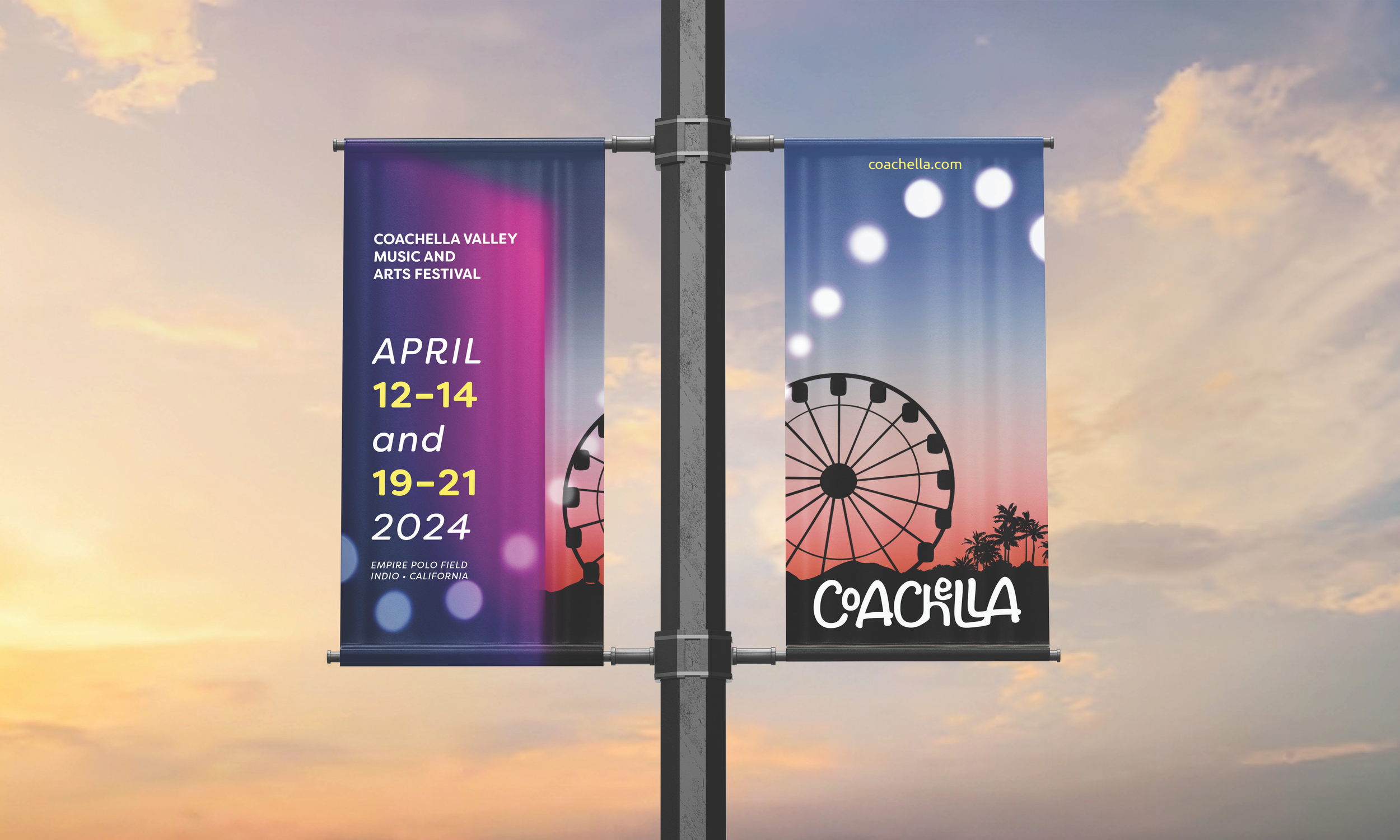
External Banners were designed in order to give the potential festival-goers knows about the information of the event.
Touchpoint 2: Planning
This touchpoint marks an important stage in the Coachella journey, where attendees transition from mere spectators to active participants, charting their course for the ultimate festival experience. From a user perspective, the goal is to gather all necessary information, make informed decisions, and ensure a seamless and enjoyable experience at the event. From a business standpoint, the planning touchpoint represents an opportunity to support attendees in their journey.
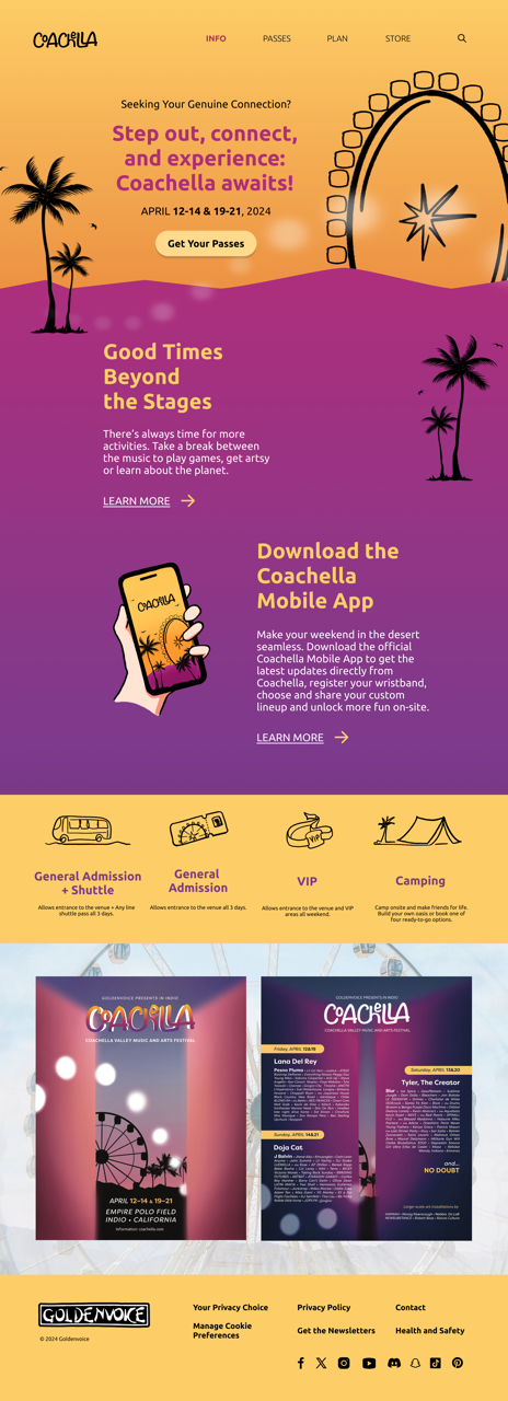
The website design for Coachella with all the features such as ticket booking, event details, and others.
Once the attendee purchased their tickets, attendees received a confirmation email showing the information about the digital tickets and information about the event.
Touchpoint 3: Waiting
This touchpoint is where anticipation reaches its peak as attendees eagerly await the arrival of the festival day. From a user perspective, the goal is to channel excitement and anticipation into preparations for the event, ensuring a smooth and seamless experience once the day arrives. Attendees eagerly await the opportunity to immerse themselves in the vibrant atmosphere of Coachella, counting down the days until they can join fellow music lovers in the desert. From a business standpoint, the waiting touchpoint represents an opportunity to enhance attendees' satisfaction and loyalty by providing them with the tools and resources they need to fully enjoy the festival experience.
In the weeks leading up to the event, these interactive countdown posts will engage attendees and foster a sense of excitement and anticipation. These posts can become a viral sensation and drive increased engagement and ticket sales.
Reminder Email with Safety Tips
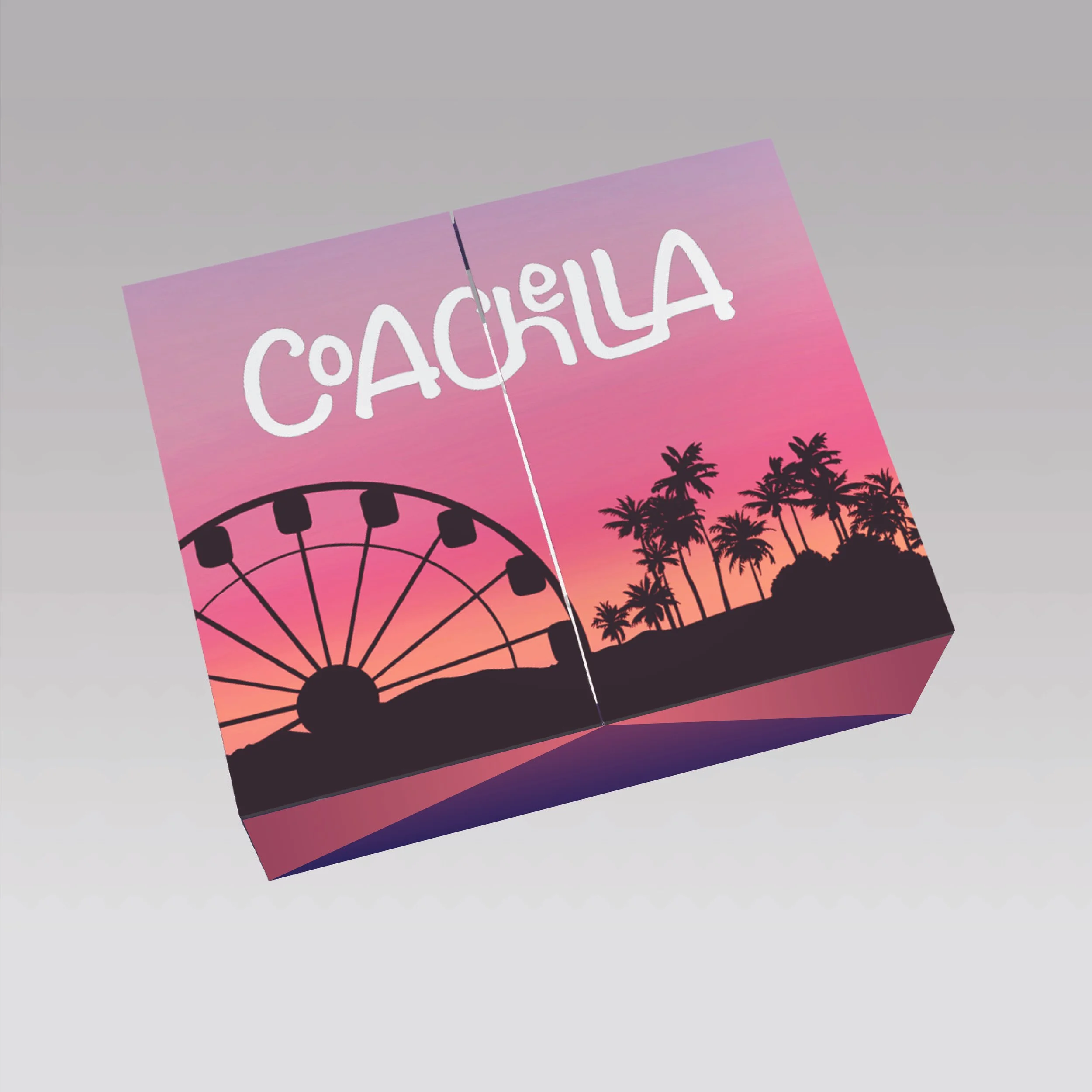
As the day of the festival drew nearer, Coachella sent out promo boxes to attendees' houses, containing essential items to facilitate their journey to the event.
These promo boxes were carefully curated to include printed tickets, wristbands, and information postcards, ensuring that attendees have everything they need to gain entry to the festival and navigate its sprawling grounds.
Attendees also received an artist name pin that they chose while buying tickets within the promo box.
These pins, adorned with the names of attendees’ favorite artists, serve as subtle yet powerful conversation starters, bridging the gap between strangers and facilitating meaningful interactions. For those who may find socializing in crowded settings daunting, the pins offer a tangible point of connection, providing a common ground upon which to initiate conversations and forge new friendships.
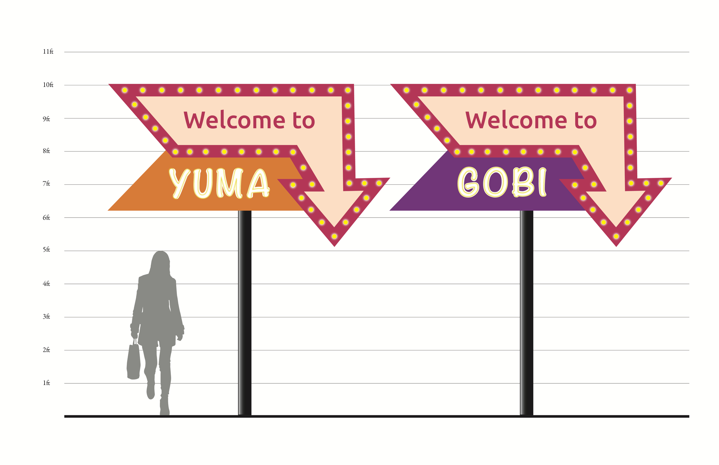
The experience touchpoint is the heart and soul of the Coachella journey, where attendees immerse themselves in the vibrant tapestry of music, art, and community that defines the festival. From a user perspective, the goal is to create lasting memories and forge meaningful connections with fellow attendees, while experiencing the energy of Coachella firsthand. Attendees seek to navigate the festival grounds with ease, discover new artists and experiences, and ultimately leave feeling inspired, fulfilled, and connected. From a business standpoint, the experience touchpoint represents an opportunity to create a seamless and unforgettable festival experience that fosters attendee satisfaction, loyalty, and advocacy.
Touchpoint 4: Experience
Touchpoint 5: Follow-up
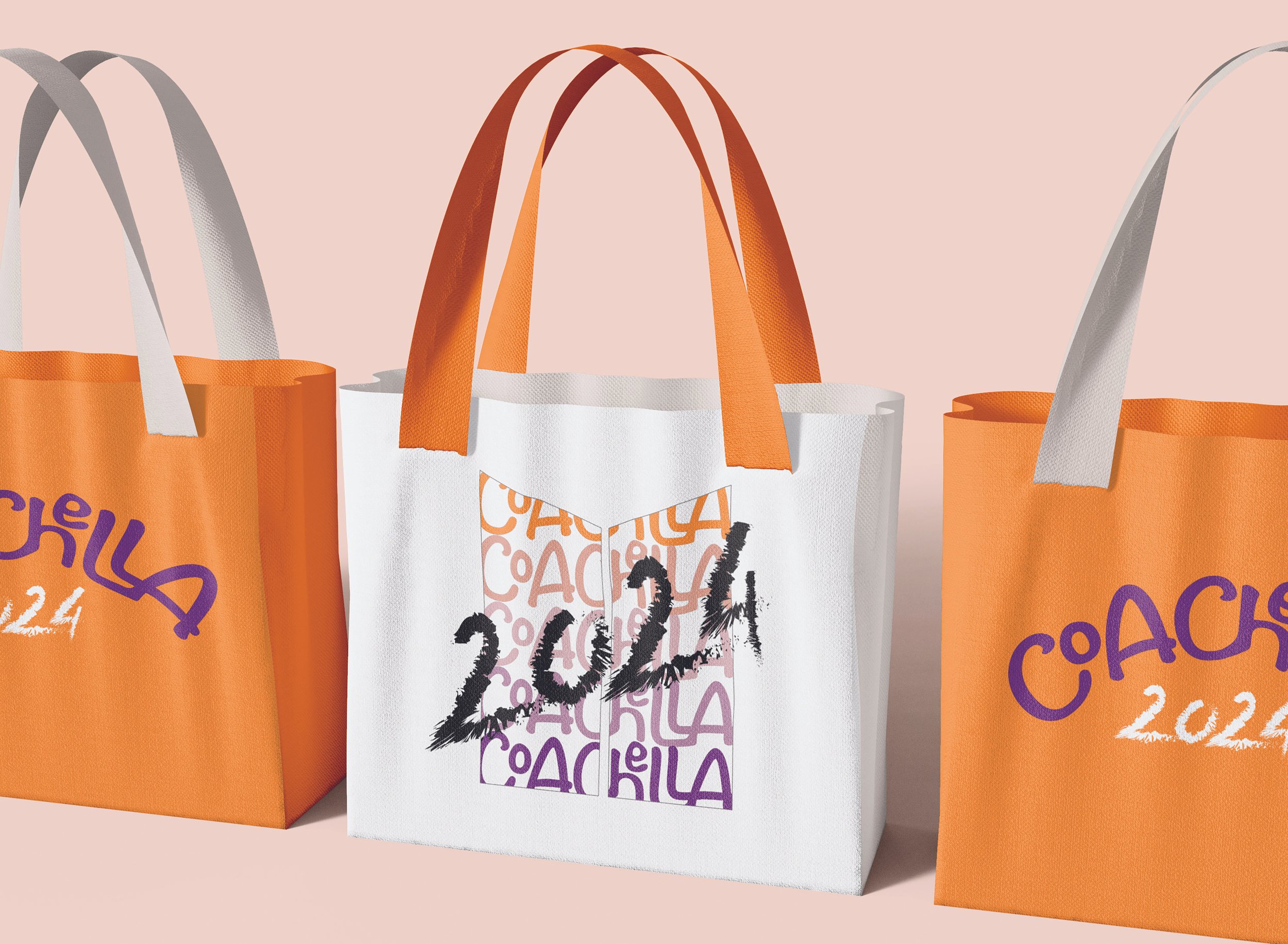
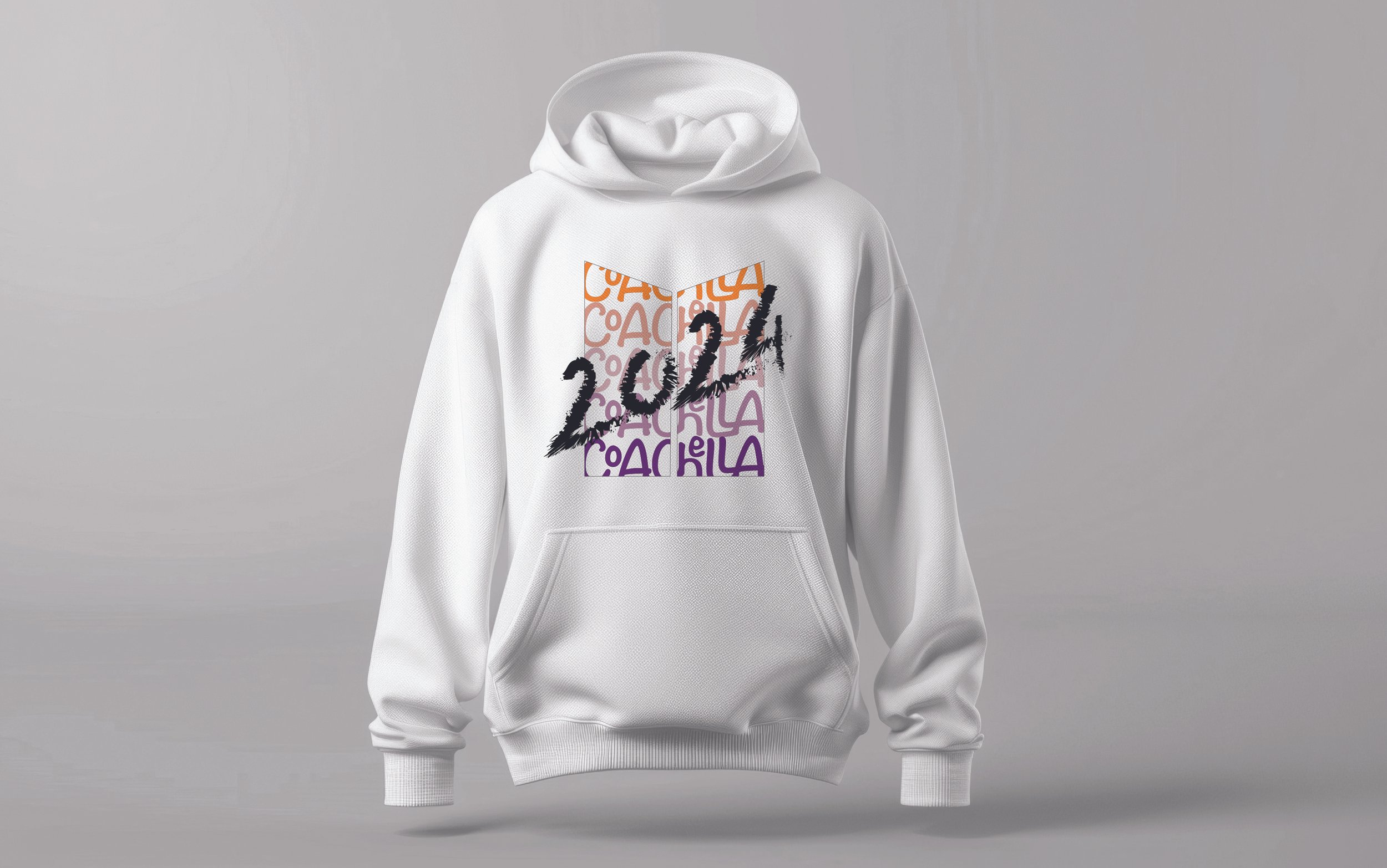
The follow-up touchpoint marks the end of the Coachella journey, where attendees reflect on their experiences and memories from the festival and begin to transition back to their daily lives. From a user perspective, the goal is to savor the memories and connections forged at Coachella. Attendees will love to preserve the energy of Coachella through merchandise, while also looking forward to these opportunities for engagement and connection again in the future. From a business standpoint, the follow-up touchpoint represents an opportunity to express gratitude to attendees, foster continued engagement and loyalty, and lay the foundation for future interactions and experiences.
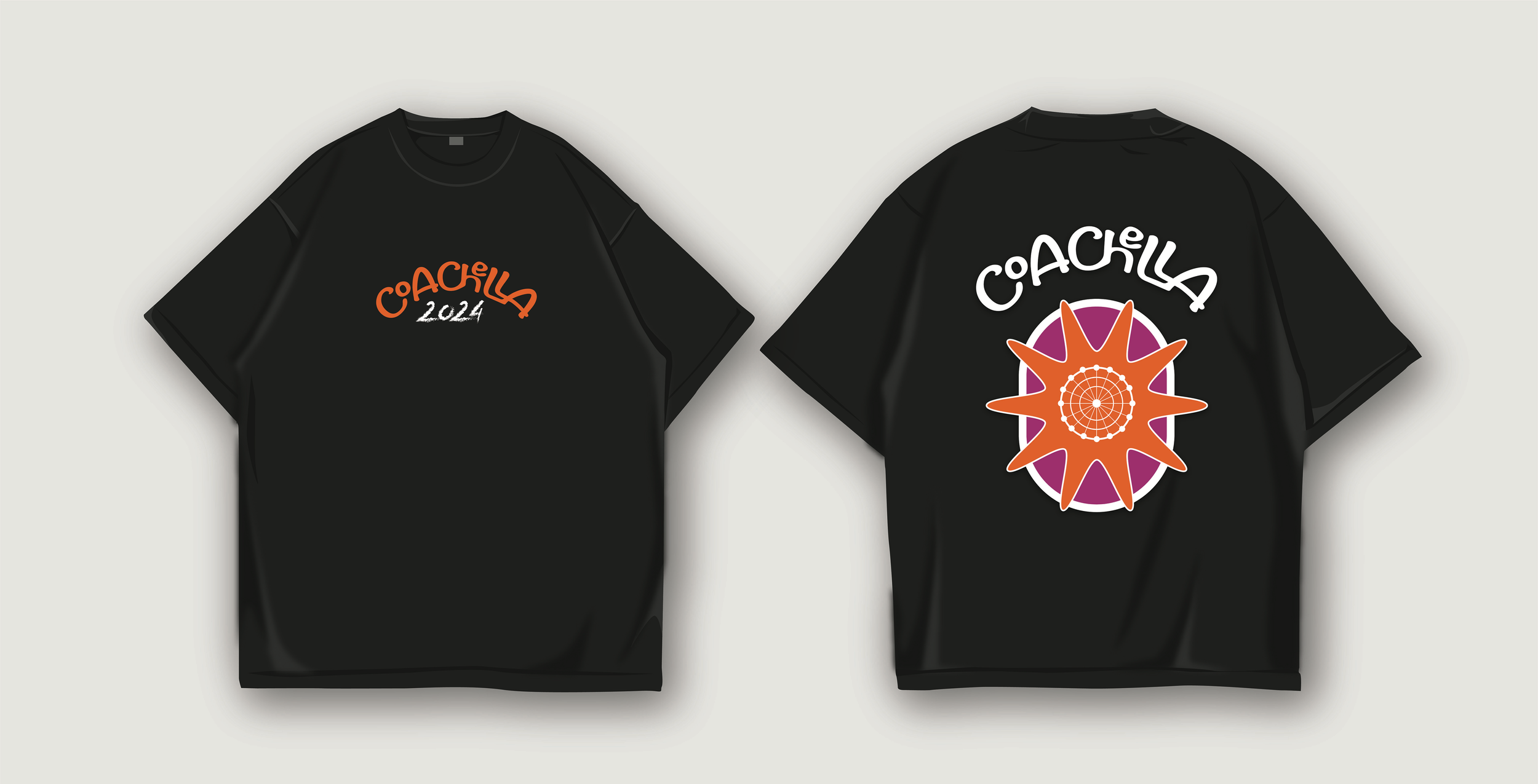
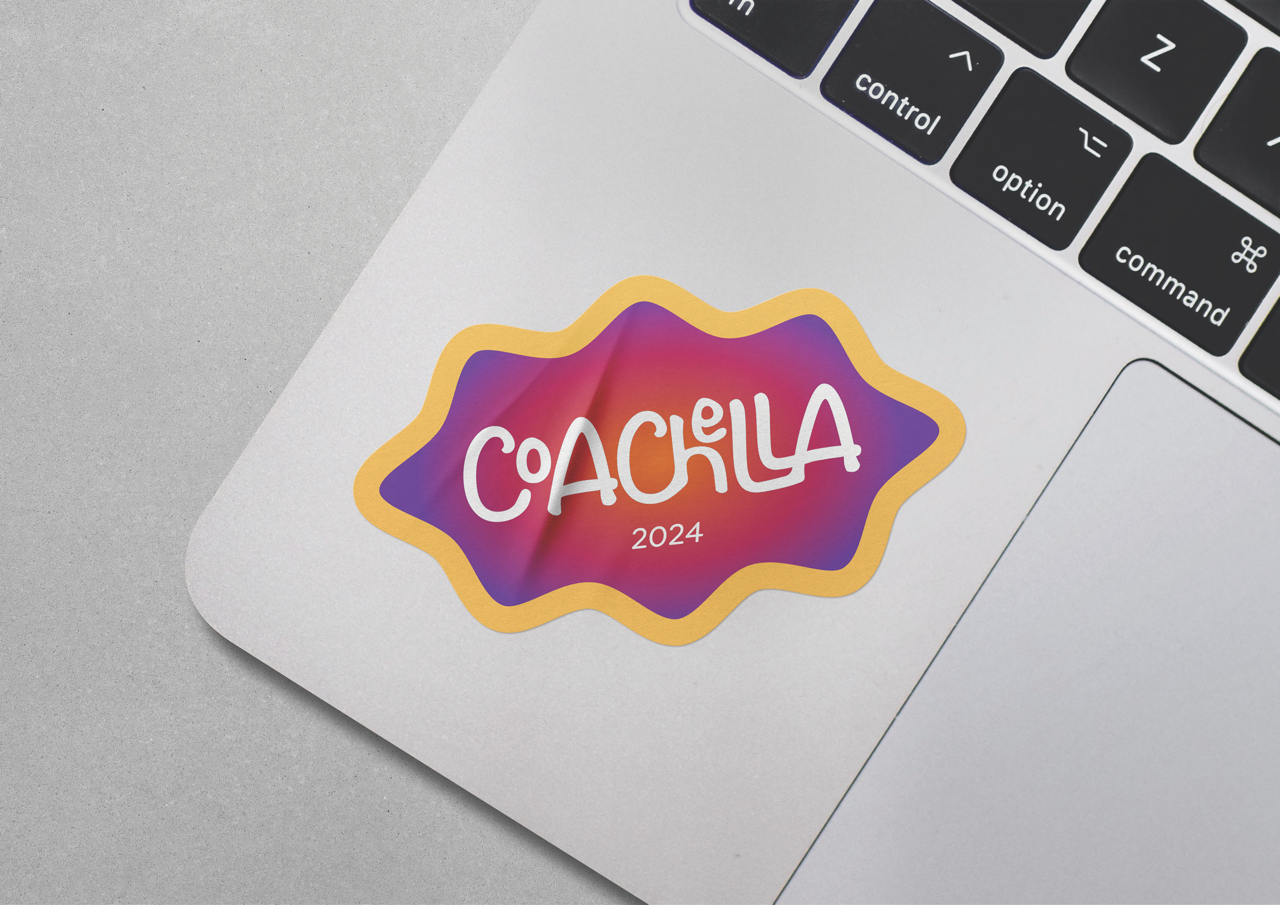

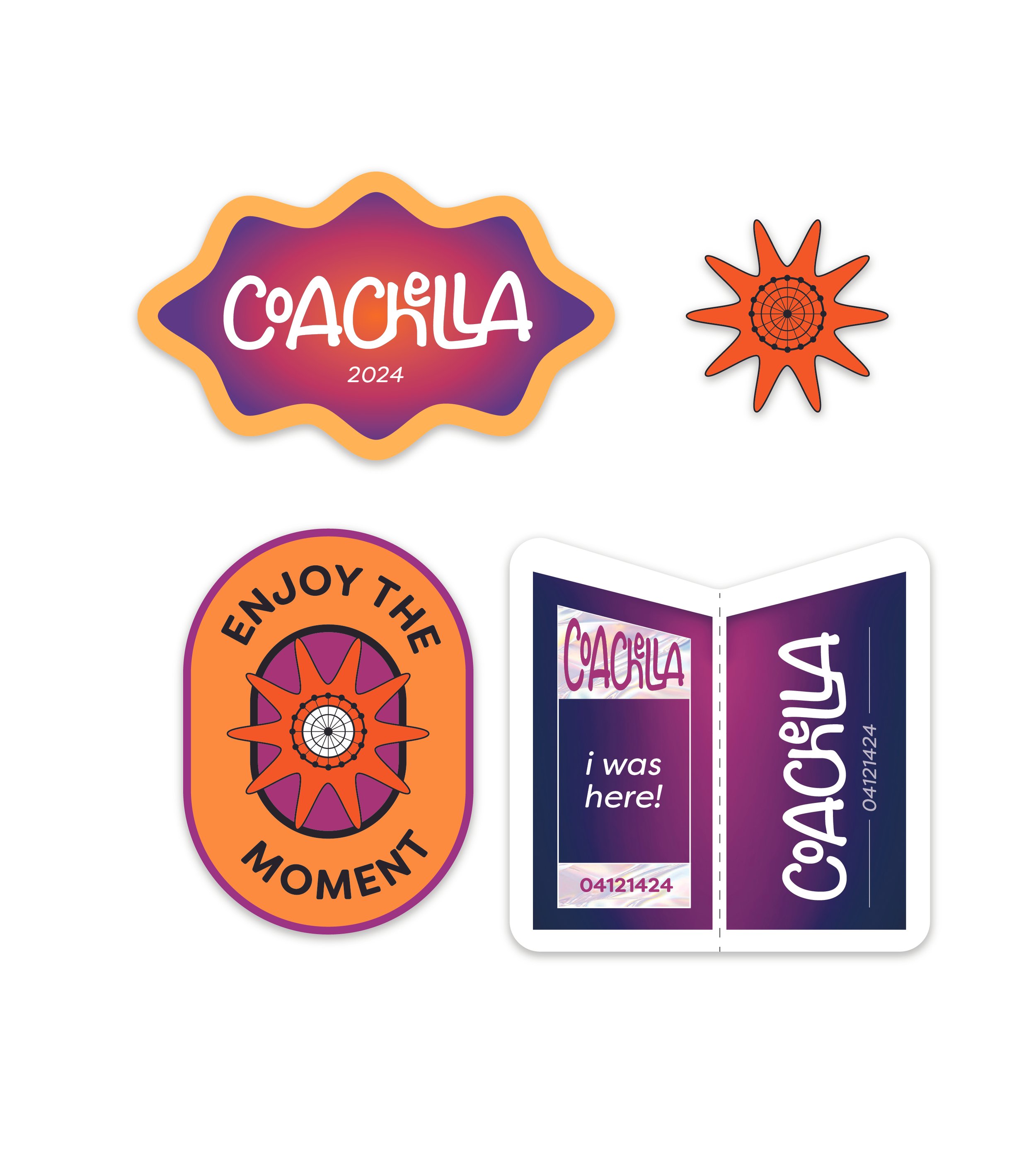
Following the conclusion of the festival, attendees received a heartfelt thank you email from Coachella, expressing gratitude for their participation and support. This email served as a token of appreciation and recognition for attendees' contributions to the success of the festival.
Additionally, there is a survey and promotions to get some positive feedback from attendees, ensuring their continued engagement and interaction with the brand.
The door is closed…
The Coachella rebranding project has successfully revitalized the festival experience, addressing core challenges for both attendees and the business. By enhancing key touchpoints throughout the journey, from awareness to follow-up, I've created a seamless and unforgettable experience. Captivating marketing initiatives increased attendance, streamlined planning, and anticipation was heightened with thoughtful promo boxes. On-site experiences fostered connections and community, while post-festival gestures expressed gratitude and kept memories alive. Ultimately, I believe that the rebranding has elevated Coachella, delivering a vibrant, modern, and inclusive experience that resonates with attendees and ensures the festival's continued success.
