

The project requires students to create a brand identity for a new kid’s park. The location of Fairytale Town is used as a reference. There are two parts in this project which are group project and individual project. As a group, students need to come up with their own park concepts such as the mission statement, points-of-distinction, target audience, park interiors, exteriors, and features. In the next part, students design the logo individually. Creating their own color palettes, business systems, and collaterals for the kid’s park.
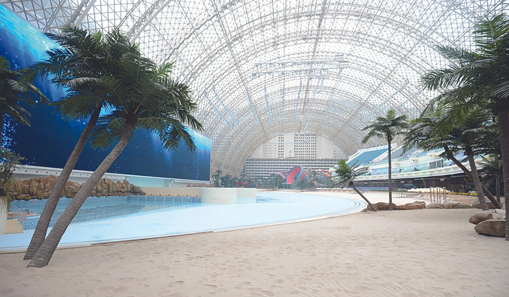
Sandy Ice Land is a theme park that provides children (from 5-10 y.o) an opportunity to experience the wonderful seasons of winter and summer. The park will bring an adventurous beach atmosphere in the summer, and a frozen pond to skate on in the winter.
Sandy Ice Land
Project for GPHD 155 (Graphic Design System II)
Year
Spring 2023
#Brandingidentity
#Systems
#Concepting
Our mission at Sandy Ice Land is to provide children an opportunity to experience the wonderful seasons of winter and summer. We bring an adventurous beach atmosphere in the summer, and a snow park and frozen pond to skate on in the winter. We invite you to this once-in-a-lifetime experience.
Mission Statement:
• We bring an artificial beach during the summer which transforms into an ice rink and snow park in the winter.
• Our popsicle mascot, Sandy Icy, greets and guides around the park.
• We offer a reward system where you can earn points towards a free birthday party by collecting hidden images of our mascot.
Point of Distinction:


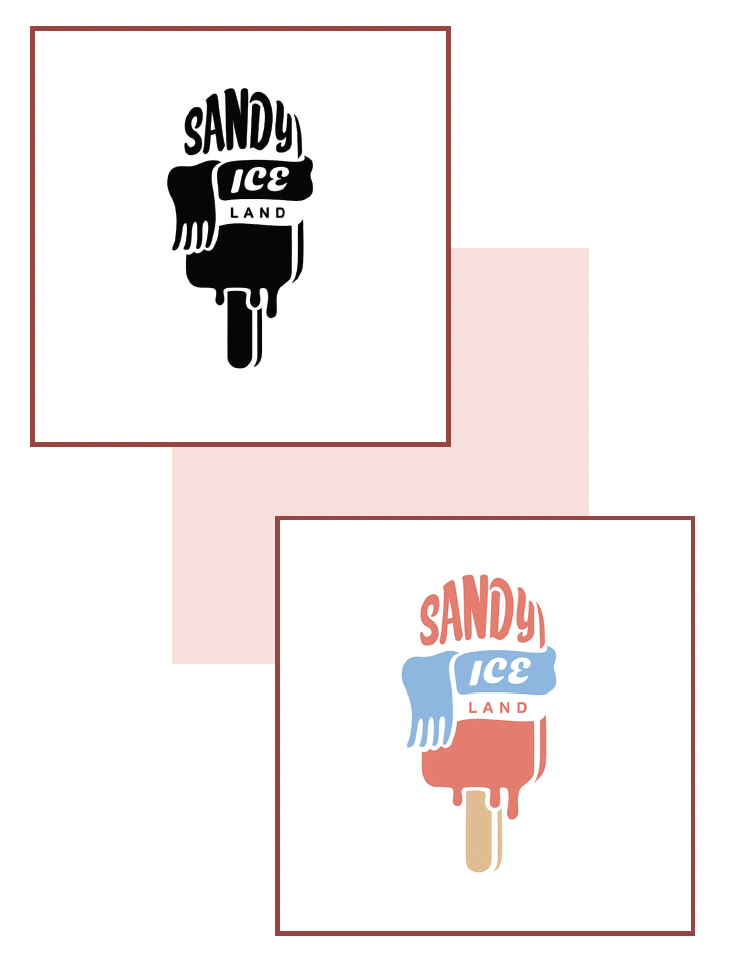
The design of the logo is a popsicle which is also the mascot of the park. The idea of a melting popsicle wearing a scarf was inspired by the points of distinction between the two main themes of the park that represents the two seasons of the year—including summer and winter which has completely opposite characteristics.
Final Logo:

The peach color represents the color of popsicle. It also expresses active energy, bright and cheerful.
The use of blue is associated with the coolness and snow in the winter.
Yellow orange is used in order to be defined as the color of the sand.
Color Palette:

